Redesigning 7-Eleven Taiwan’s OPENPOINT super app
As the design-focused consultant in a two-person team, I translated shared research into 15+ design recommendations for OPENPOINT’s two-year product roadmap.
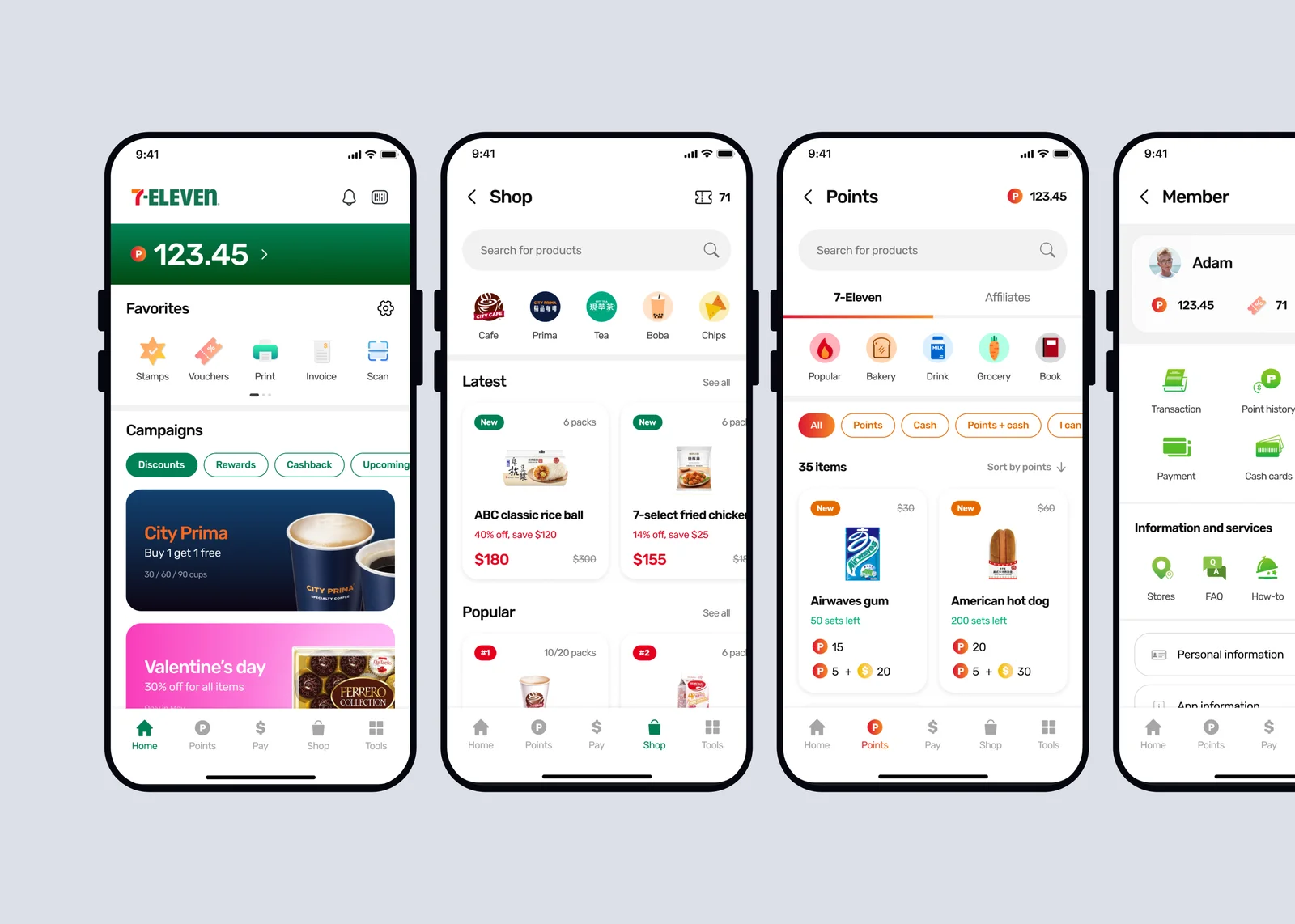
Usability issues and limited user insight left the team without clear priorities.
OPENPOINT had 12 million users and 2 million monthly active users in 2021, but users described the experience as messy and difficult to navigate. The product team had limited insight into user needs and no prioritised problem area.
*This is a personally updated version of the case study, now in English.
Three redesigns targeted the homepage, vouchers, and points.
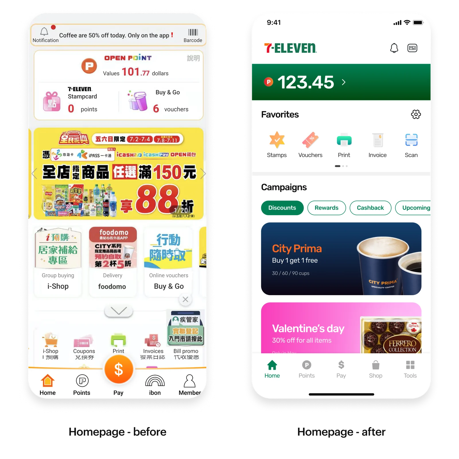
Problem 1: Homepage clutter made features hard to find
The way-finding experience was problematic. The home screen was seen as messy and distracting with advertisements scattered around everywhere. Users struggled to find specific features.
Solution 1: Grouped content and customisable favourites
By splitting the home screen into conceptual areas: features and advertisement, users can easily locate things by topics. A “Favorite” section was also added to allow customization based on users’ different feature needs.
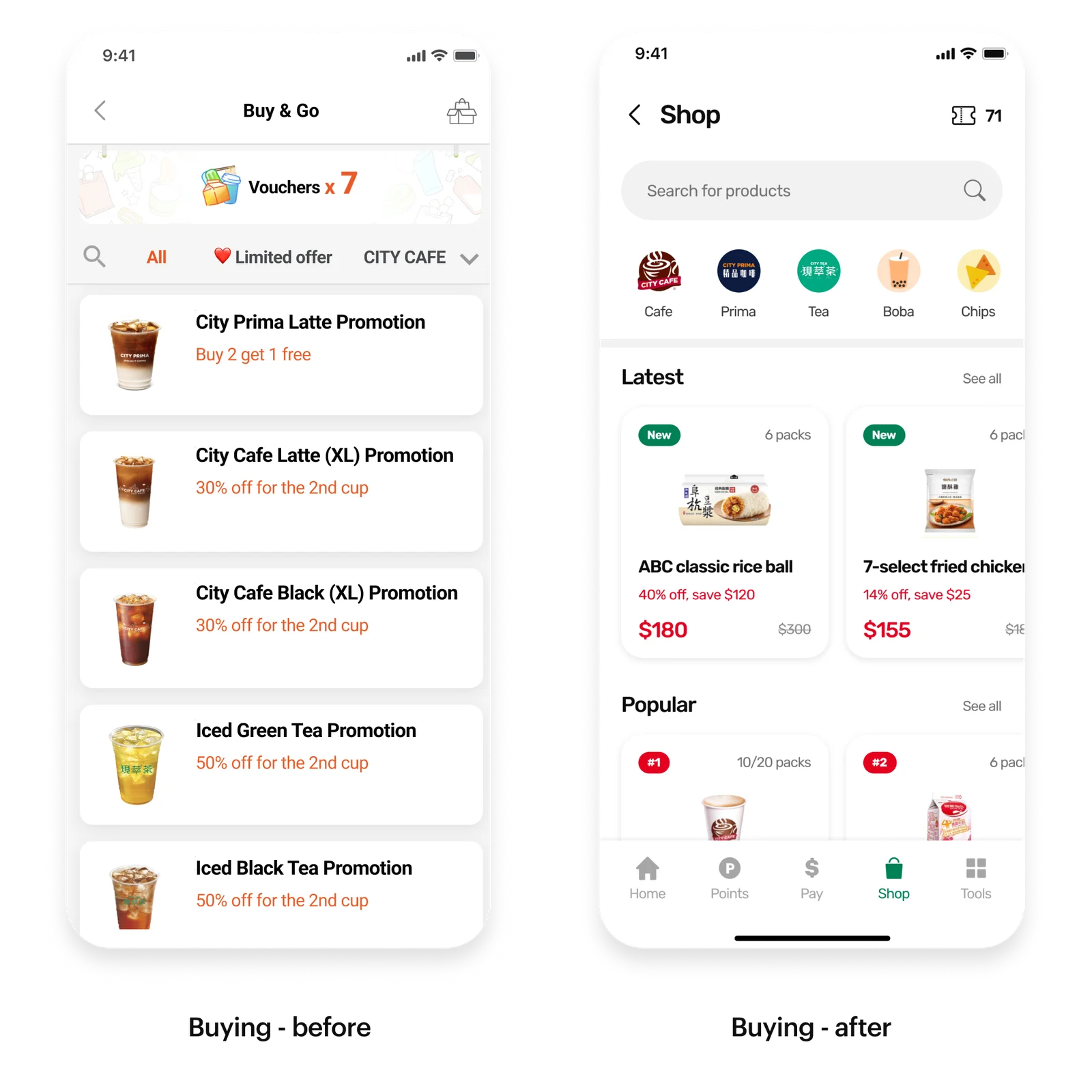
Problem 2: Vouchers were hard to find
When browsing vouchers to buy, many users didn’t notice the search and category feature at a glance. It’s also hard to identify new products from the single column listing. Users took time to find specific vouchers they want to purchase.
Solution 2: Prominent search, categories, and richer cards
I made the search bar bigger and placed it on top so it’s always accessible. The category tabs design was more evident and identifiable with icons and logos. Horizontal layout and rich product cards were created to have a balanced visual and information display, making new products easier to discover.
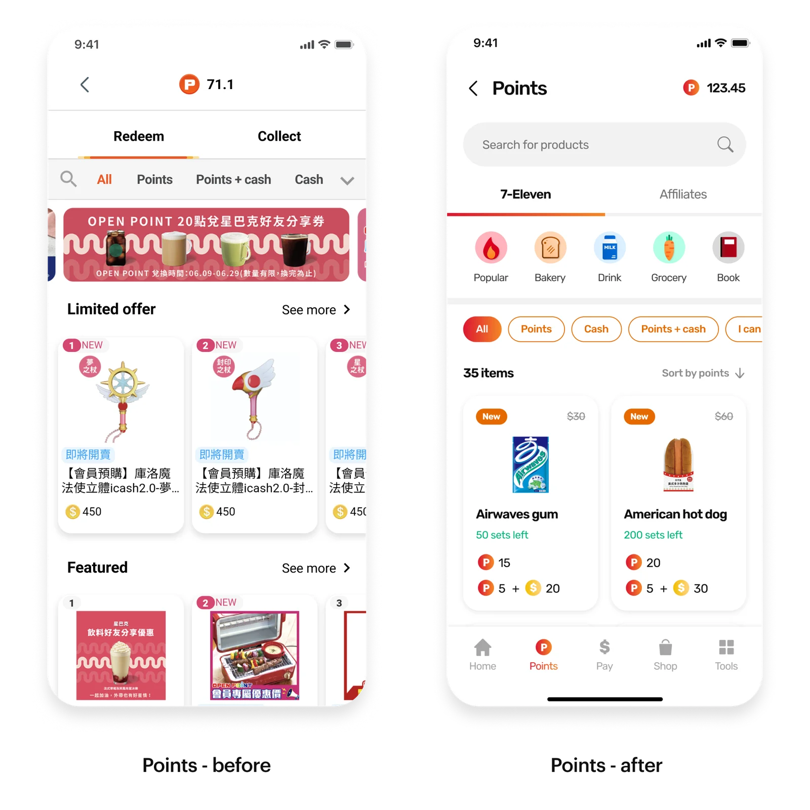
Problem 3: Redemption products were hard to explore
When exploring redemption products, many users felt that there wasn’t too much to explore. The ill-planned categories made the listing a mix of products from multiple brands. Users found the product listing random and confusing to navigate.
Solution 3: A clear, three-level category hierarchy
I created a three-layered category system to give a better hierarchy of redemption products by separating brands, product types and redemption methods. This made the products easier to explore with a better navigation.
50%+ of recommendations were implemented; separately, MAU grew 2.5× by 2023.
As a design consultancy, we didn’t control implementation, so the MAU increase cannot be attributed to our work alone. Over 50% of our design suggestions were implemented in the proposed ways during the following two years.
Despite rapid growth, the product team lacked deep user insights.
The super app—OPENPOINT offers a variety of services, including mobile payment, a loyalty program, and O2O (online to offline) shopping. With the rapid growth in users, its UX has been criticized by the public.
As the marketing campaign continued to draw more users in, 7-Eleven wanted to improve their retention by increasing their monthly active users. However, they had very little knowledge of their users. They were budgeted for an enhancement project but didn’t know where to start.
“Our team’s goal was to help 7-Eleven understand their users, identify user problems, and suggest design solutions to improve UX and ultimately increase user satisfaction and monthly active users.”
Undefined priorities and a fixed scope constrained the redesign.
The client didn’t have a prioritized problem to solve. Hence, we were given flexibility to decide what to work on. Our first step had to be investigating the overall app experience broadly instead of diving deep into a specific journey.
Since a majority of their users are middle-aged and less tech-savvy, the learning curve for them to embrace changes is higher. As a result, we were asked to keep the app sitemap intact and only focus on five parts of the super app—Homepage, Buying, Points, Payment, and Member Center.
We had to modularize enhancements for incremental changes.
Turning shared research into client-aligned design.
The other consultant focused on business recommendations, while I owned the design activities. We planned the research and analysed insights together; I translated the findings into design deliverables.
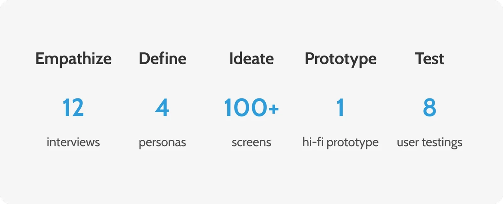
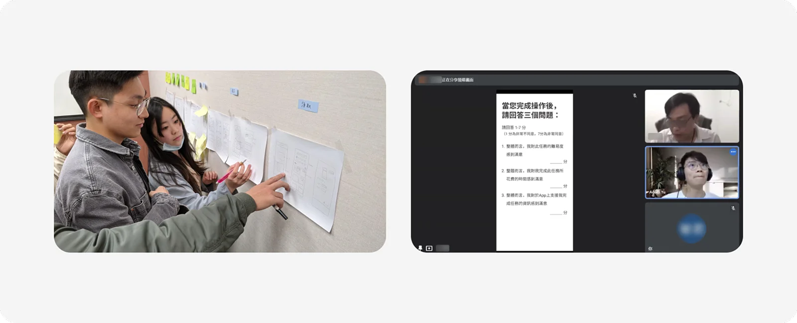
We recruited 12 users with diverse backgrounds for 2-hour semi-structured interviews and usability tests. After analyzing the data and ideating solutions, we developed a high-fidelity prototype and validated it with 8 additional users before finalizing our design recommendations.
I led internal brainstorming workshops for the design solutions and presented the resulting solutions in client meetings. I worked closely with the client’s product manager to align requirements with technical constraints.
Research revealed four personas and two shared user needs.
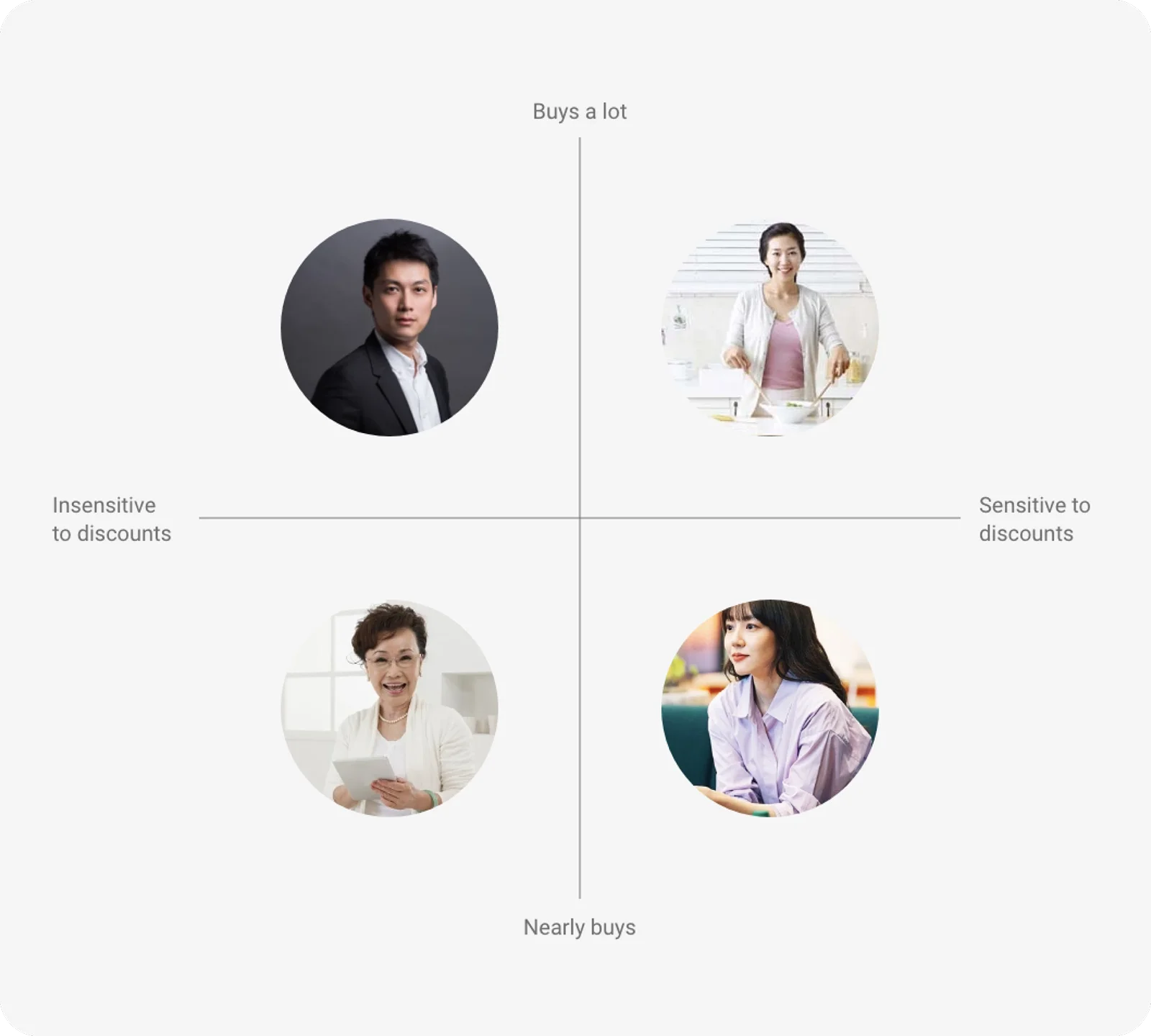
Four personas defined by discount sensitivity vs. purchasing power
We discovered that user’s sensitivity to discounts and their purchased amounts of online vouchers (e.g. coffee vouchers) construct the x-axis and y-axis that split our users into four personas.
The two axes represented users’ different needs and usage patterns, including their usage frequency and the features they use the most. This gave us great insights for the ideation phase. It also helped to communicate with our clients on design rationales.
Common needs — Users expect a simpler layout and less repetitive steps
We found that across all types of users, they referred to the app as messy, and complicated with too many features. They often get lost because the screen feels too busy and the steps feel repetitive.
“How might we deliver a better experience by adjusting layouts and reducing redundant steps.”
Common needs — Users only expect things they care about to stand out
We also concluded that customization was important because users’ needs are so different that they only expect things they care about to stand out. Irrelevant information was seen as unnecessary, which made them feel the app was complicated.
For instance, users who don’t seek any advertisement expect quick access to certain features they use in the app whereas users who actively search for all clues of promotions on the app are willing to spend time exploring and reading all the details.
“How might we deliver a better experience by providing customization in the app.”
Overall, we provided 15+ design suggestions. Many of them are related to users’ way-finding, navigation, and browsing experiences.
Interested in working together? Reach out at y3vu060312@gmail.com or connect on LinkedIn.